Color Used
Primary Color
#003057
Secondary Color
#800000
Text Color
#000000
Text Color
#6b6b6b
BG Color
#F3F3F3
Low-Fidelity Wireframe
Target Audience
-
End-to-End Technology Delivery Lead
-
Business Owner
-
Executive Sponsor
-
Development Lead
-
Product Manager
-
Product Lead
-
Product Owner
-
Portfolio Manager
-
Program Manager
-
Project Manager
The Approach
-
Conducted stakeholder interviews to gather feature needs and frustrations
-
Audited the current dashboard to identify usability gaps and data inconsistencies
-
Researched integration feasibility to ensure the proposed design would function seamlessly with the current API framework, including Syncfusion components
-
Wireframed layouts in Lucid to test visual grouping, hierarchy, and flow
-
Prototyped interactive mockups in Figma showing filters, tabs, export features
-
Iterated on designs based on feedback from User Research
-
Delivered developer-ready handoffs for integration into the platform
Empathy Map
Says
'Why do I have to filter every time? Can’t it remember?'
Thinks
'Am I meeting targets? Will leadership see this as progress?'
Does
Pull weekly reports, cross-check with status meetings
Feels
Anxious when metrics misalign, confident when filters work well

Design Thinking Process
The design thinking process for the Portfolio Trends Reporting Dashboard focused on a user-centered approach to transform complex performance metrics into an intuitive, functional experience. It followed these five stages:
Empathize
User Research
User Interview
Entrant Analysis
Define
User Persona
User Jouney Map
Goal Statement
Empathy Map
Ideate
Brainstorming
Card Sorting
User Flow
Design
Paper Wireframes
Visual Design
Prototype
Test
Check Usability
Survey Insight
Improvements

Ellen Janes
Age: 40s - 50s
Education: Bachelor of Science
Status: Married
Occupation: VP, Information Technology
Location: Colorado
Personality
-
Organized
-
Cautious
-
Goal-drive
Breif Story
Data should tell a clear and actionable story.
Goals
-
Ensure team meets Annual Budget Commitment (ABC)
-
Report progress to leadership
Frustations
Manually matching Annual Budget Commitment (ABC) and Live views
Needs
Streamlined views and better filter recall
Motivations
High visibility and accountability in leadership reporting
Define Phase
User Persona
The Portfolio Trends Reporting Dashboard is designed for cross-functional leaders such as End-to-End Technology Delivery Leads, Product Managers, Portfolio Managers, and Executive Sponsors. These users are data-driven decision-makers who need timely, filterable insights on project delivery, priority changes, and baseline shifts across portfolios. They value clarity, drill-down capabilities, and exportable data to support planning, forecasting, and performance tracking. Their primary needs include real-time visibility, intuitive navigation, and consistency across Annual Budget Commitment (ABC) and live metrics to inform both tactical actions and strategic reporting.

Arron Lane
Age: 40s - 50s
Education: BA, Communications
Status: Married
Occupation: Princ Product Delivery Mgr III
Location: Colorado
Personality
-
Agile
-
Tactical
-
Fast-paced
Breif Story
If it’s not actionable today, it’s noise.
Goals
Track projects delivery status
Frustations
Lack of drill-down in summary view
Needs
Contextual exports and initiative-level visibility
Motivations
Aligning sprint work with executive expectations

Key Insight Derived
-
Annual Budget Commitment (ABC) Activity tab is accessed 3x more than Live Data.
-
40% of export requests are filtered by Owner, 25% by Portfolio.
-
Only 12% of users consistently apply Date filters.
-
Filter abandonment rate was high (nearly 40%).
Sources
-
User Analytics usage logs
-
Export log frequency
-
Filter selection logs
-
User support tickets
-
User bi-weekly updates, discussion meetings, and focus group sessions
Quantitative Research
We conducted quantitative research by analyzing usage metrics, export frequencies, and filtering behaviors within the existing Portfolio Trends Reporting Dashboard. This data helped us identify patterns in how users interacted with filters, what time ranges were most commonly selected, and which rows received the highest drill-down engagement. These insights allowed us to prioritize enhancements to filter usability and default views based on real user behavior.
Empathize Phase
Qualitative Research
Through user interviews and direct observations with End-to-End Tech Leads, Portfolio Managers, and Product Owners, we uncovered deeper frustrations and needs not captured in usage data alone. Key findings included confusion around date-filtered versus static metrics, difficulty locating relevant priority-level data, and a desire for consistent drill-down access and export formatting. These conversations guided the restructuring of the Annual Budget Commitment (ABC) and Live tabs and informed the placement of contextual help and tooltips.
Interview Questions
-
What metrics are most important for your daily reporting?
-
How often do you use the Annual Budget Commitment (ABC) or Live tabs?
-
What frustrates you most about the current filters?
-
Do you rely more on date-filtered or static metrics?
-
How important is export functionality to your workflow?
-
How do you validate if a report is accurate or complete?
-
What insights do you expect to quickly gather from the dashboard?
-
What information do you often have to dig deeper for?
-
Describe a time when the Trends dashboard helped you make a decision.
Key Insight Derived
-
Users find it confusing that some metrics are date-filtered and others are not.
-
Default filters are often left unchanged because they reset too easily.
-
Many users rely heavily on the export feature for cross-team communication.
-
The Annual Budget Commitment (ABC) tab is most used at beginning-of-year planning, while Live data is accessed regularly for operational updates.
-
Users need more help text to clarify metric definitions.
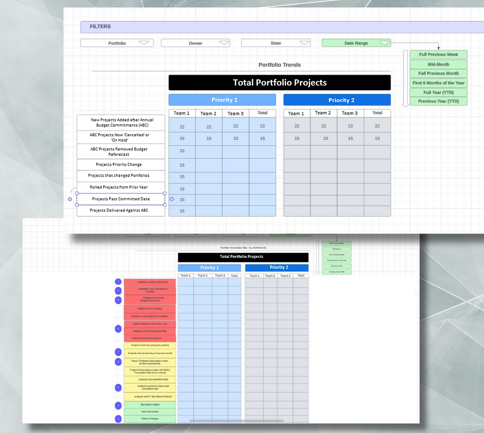
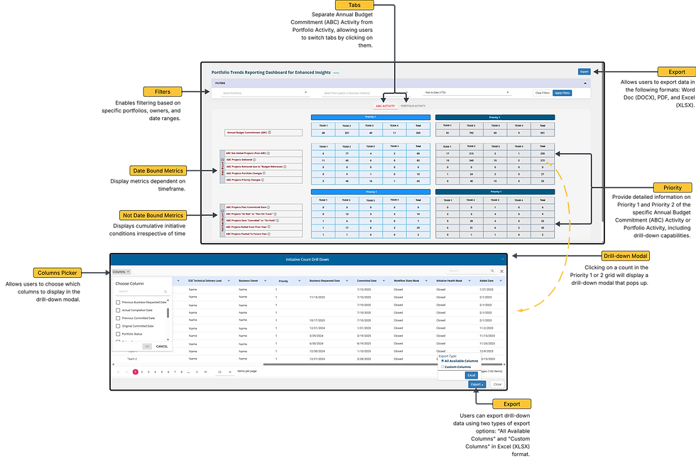
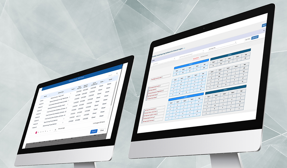
Portfolio Trends Reporting Dashboard for Enhanced Insights
Type: Web Application | Role: UI/UX Designer & Business Analyst | Project: Digital Platform Reporting
I designed the Portfolio Trends Reporting Dashboard to give users a clear, real-time view of portfolio performance. It expands on existing metrics by offering both high-level and detailed insights, making it easier to priority trends, analyze progress against goals, and generate consistent, exportable reports across teams.
Deliverables: High-fidelity Figma mockups, Lucid Chart, Snagit, interactive filters, modular layouts
Problem Statement
The existing Portfolio Trends Reporting Dashboard lacked clarity and usability for analyzing and exporting key metrics. Users struggled to distinguish between date-filtered and cumulative metrics, filter data consistently across views, and interpret trends by team and priority. The disorganized display and lack of context made it difficult for stakeholders to priority project performance and portfolio health.
Possible Solution
Redesign the Portfolio Trends Reporting Dashboard with two clearly separated tab views: Annual Budget Commitments Activity and Live Data (Portfolio Activity). Within each view, apply a clean visual hierarchy to distinguish date-filtered metrics from cumulative metrics, supported by instructional text. Introduce advanced filter functionality (Portfolio, Owner, Date), dynamic data grouping by team and priority, and an export feature that respects all filters. The design improves scannability, decision-making, and alignment across departments.

Task Flow
The Process of Reviewing Portfolio Progress
Typography & Colors
Font Used:
Open Sans|
ABCDEFGHIJKLMNOPQRSTUVWXYZ
ABCDEFGHIJKLMNOPQRSTUVWXYZ
1234567890
The Open Sans font is a popular choice for websites and user interfaces because of its excellent readability and neutral, friendly appearance. That’s why I chose to use this font.
Open Sans Bold
Open Sans Regular
Visual Design

.png)