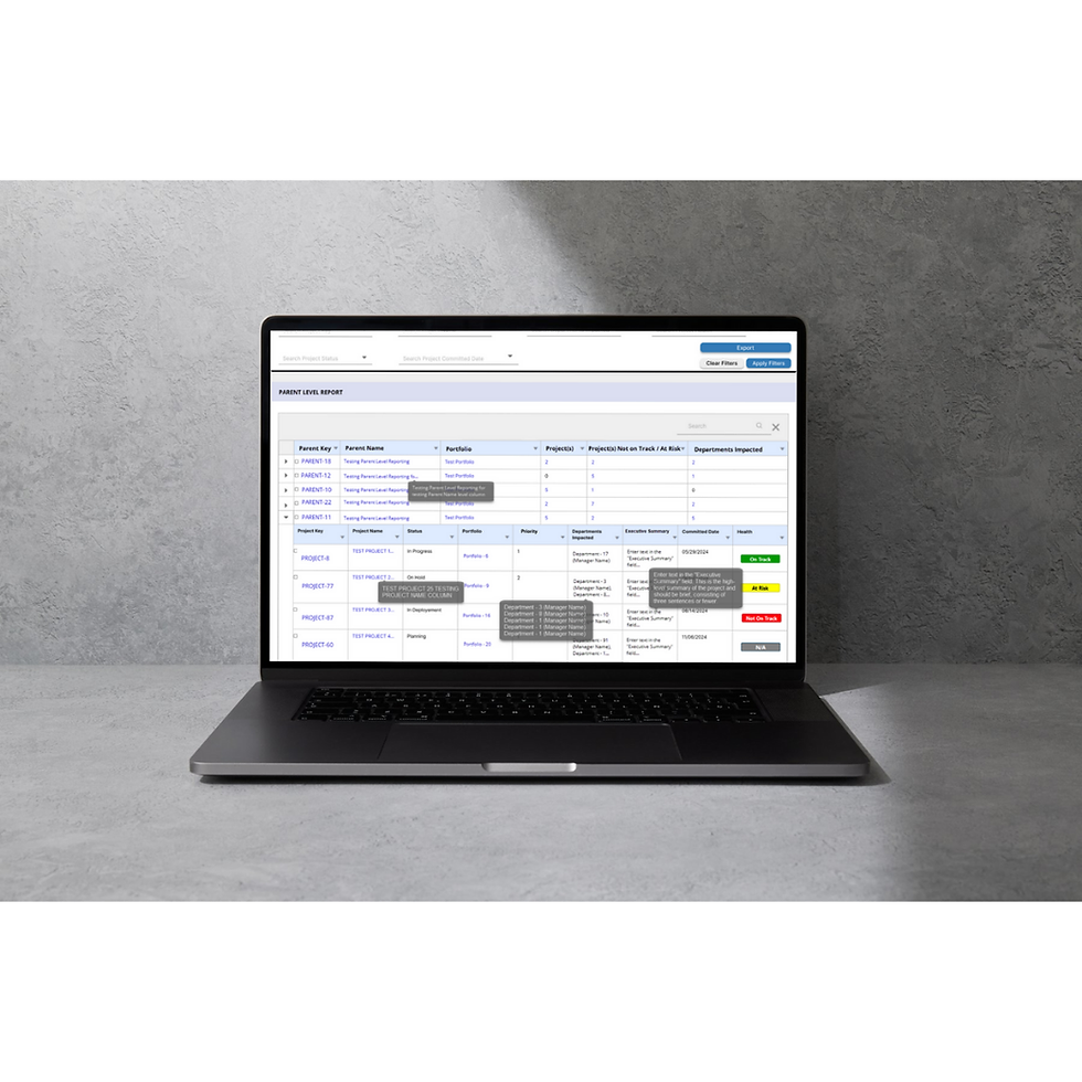
Parent-Level Reporting Dashboard
Type: Web Application | Role: UI/UX Designer & Business Analyst | Project: Digital Platform Reporting
The Parent-Level Reporting Dashboard was designed to give teams outside of core technical portfolios a standardized way to track and report their projects. These projects may not directly affect technical baselines but still require visibility, planning, and alignment.
This dashboard integrates with the Portfolio Reporting Platform and offers a clear, flexible view for teams to manage department-led projects across planning cycles and delivery timelines—without disrupting central reporting logic.
Deliverables: High-fidelity Figma mockups, Lucid Chart, Snagit, interactive filters, modular layouts
Problem Statement
Non-technical teams lacked a way to track and communicate their projects within the existing reporting ecosystem. Their work was often invisible in traditional dashboards, leading to manual reporting, disconnected planning, and inconsistent updates to leadership.
Without a scalable solution, teams resorted to building slide decks and spreadsheets—introducing redundancy, misalignment, and confusion when collaborating across departments.
Possible Solution
Create a new reporting dashboard tailored for team-led efforts, with:
-
A flexible layout for department-specific initiative portfolios
-
Filtering by Team, Priority, and Planning Window
-
Clear distinction between current-year delivery and future-year planning
-
Visual summaries of delivery status and initiative counts
-
Exportable views that match platform-wide reporting standards
-
Integration with the Portfolio Reporting Platform without impacting existing technical metrics
Target Audience
-
End-to-End Technology Delivery Lead
-
Business Owner
-
Executive Sponsor
-
Development Lead
-
Product Manager
-
Product Lead
-
Product Owner
-
Portfolio Manager
-
Program Manager
-
Project Manager
The Approach
-
Interviewed key stakeholders representing business-led planning groups
-
Mapped existing pain points in ad hoc reporting workflows
-
Audited overlapping projects between technical and team-driven efforts
-
Created wireframes to visualize layout options and filter groupings
-
Prototyped in Figma and validated use cases through feedback sessions
-
Aligned with data engineers to ensure no impact on existing metrics
-
Finalized a dashboard that supports both operational and strategic views

Design Thinking Process
The project followed a structured design thinking process focused on accessibility, visibility, and alignment for underrepresented teams:
Empathize
User Research
User Interview
Entrant Analysis
Define
User Persona
User Jouney Map
Goal Statement
Empathy Map
Ideate
Brainstorming
Card Sorting
User Flow
Design
Paper Wireframes
Visual Design
Prototype
Test
Check Usability
Survey Insight
Improvements

Key Insight Derived
-
Over 60% of teams maintained separate tracking systems
-
Nearly half wanted views consistent with the Portfolio Reporting Platform
-
Users needed clear future planning toggles, separate from in-year delivery
-
A majority wanted the ability to export filtered views for leadership
Sources
-
Internal presentation archives
-
Reporting request logs
-
Team feedback from planning reviews
-
Export and filter feature usage stats from platform dashboards
Quantitative Research
-
Audited slide decks and spreadsheets used for manual reporting
-
Tracked how often requests came in for custom initiative views
-
Measured overlap between team-led and technical delivery timelines
Empathize Phase
Qualitative Research
Conducted interviews with users managing projects outside of the technical portfolio system. These users supported operations, business planning, and enterprise-level coordination.
Interview Questions
-
How do you currently track your projects outside of core portfolios?
-
What’s difficult about preparing monthly or quarterly updates?
-
Do you need to report both current delivery and future planning?
-
How important is alignment with platform-wide dashboards?
-
What would an ideal reporting tool look like for your team?
Key Insight Derived
-
Users feel disconnected from standard reporting processes
-
Their projects are important but underrepresented
-
Manual report creation leads to wasted time and inconsistent messaging
-
Teams want standardization, but with enough flexibility to represent their scope and goals
Define Phase
User Persona
These users lead business-driven or operations-focused projects that fall outside of core delivery portfolios. They often manage their own strategic programs and need a standardized way to track, plan, and report projects within the same platform as technical teams. They value autonomy, but also want their data and reporting format to align with platform-wide tools to ensure credibility and consistency.
-
Primary Goals:
-
Maintain visibility for department-led work
-
Report delivery and planning in a scalable, familiar format
-
-
Pain Points:
-
Lack of representation in existing portfolio dashboards
-
Manual slide building and spreadsheet tracking
-
-
Needs:
-
Flexible filters and planning toggles
-
Exportable, presentation-ready reports
-
Alignment with shared reporting language and visuals
-

Abigail Gerica
Age: 50s - 60s
Education: Master’s in Organizational Leadership
Status: Married
Occupation: Director of Business Operations
Location: St. Louis, MO
Personality
-
Process-Driven
-
Assertive
-
Collaborative
Breif Story
Abigail leads cross-functional business projects that operate independently of core technical portfolios. She needs a reporting tool that allows her team’s efforts to be tracked and communicated clearly during strategy meetings.
Goals
-
Deliver consistent reporting to senior leadership
-
Showcase delivery progress and strategic alignment
Frustations
-
Constant need to rebuild charts manually
-
Limited visibility compared to technical teams
Needs
A structured dashboard that mirrors platform-wide views
Motivations
Advocate for operational value and team impact

Elijah Kim
Age: 30s - 40s
Education: B.A. in Communications
Status: Single
Occupation: Strategic Planning Lead
Location: Seattle, WA
Personality
-
Strategic
-
Insightful
-
Organized
Breif Story
Elijah supports planning for high-level organizational projects and coordinates delivery timelines across teams. He often works from scratch to present projects that fall outside traditional portfolios.
Goals
-
Plan effectively for upcoming years
-
Integrate reporting into executive reviews
Frustations
-
Lack of visibility into the big picture
-
Disjointed tools and reporting logic
Needs
Filterable dashboard with planning vs. current year toggle
Motivations
Help leadership make data-driven resourcing decisions
Empathy Map
Says
"Why don’t we have access to the same level of visibility?”
Thinks
“Are our projects even being counted?”
Does
Builds separate tracking tools and sends slides every month
Feels
Frustrated and undervalued, yet motivated to drive change

Task Flow
The Process of Reviewing Parent-Level Reporting Dashboard
Low-Fidelity Wireframe


Typography & Colors
Font Used:
Open Sans|
ABCDEFGHIJKLMNOPQRSTUVWXYZ
ABCDEFGHIJKLMNOPQRSTUVWXYZ
1234567890
The Open Sans font is a popular choice for websites and user interfaces because of its excellent readability and neutral, friendly appearance. That’s why I chose to use this font.
Open Sans Bold
Open Sans Regular
Color Used
Primary Color
#DBDDF1
Secondary Color
#DEEBFF
Text Color
#000000
Text Color
#6b6b6b
BG Color
#EFEFEF
Visual Design