Portfolio Statistics Dashboard Redesign
Type: Web Application | Role: UI/UX Designer & Business Analyst | Project: Digital Platform Reporting
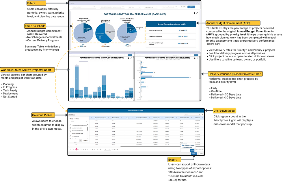
The Portfolio Statistics Dashboard Redesign modernized a legacy reporting interface that had become difficult to use and visually outdated. Originally built as a dense, table-heavy view of initiative totals, the tool lacked clarity, consistency, and responsiveness to user needs.
This redesign transformed the dashboard into a more interactive, filterable, and visual experience—designed to help teams quickly interpret key metrics, review progress across priorities, and export relevant data for leadership and operational reporting.
Deliverables: High-fidelity Figma mockups, Lucid Chart, Snagit, interactive filters, modular layouts
Problem Statement
The original statistics dashboard offered limited usability and little visual distinction between key metrics. Users struggled to interpret initiative counts, delivery status, and scope changes. Filter behavior was inconsistent, and exports required heavy manual editing.
These issues made it hard for teams to align reporting, communicate progress, or trust the data they were working with—especially when preparing updates for leadership.
Possible Solution
Redesign the dashboard with a more modern, user-friendly layout that includes:
-
A Quick Metrics Summary for initiative totals and delivery breakdowns
-
Visual indicators for delivery health (e.g., Early, On-Time, Late)
-
Priority-based grouping of initiatives
-
Filtering by Team, Owner, and Portfolio
-
A toggle between table and chart views to accommodate different users
-
Help text and hover tooltips to clarify metric definitions
-
Export features that mirror the on-screen filtered data
Target Audience
-
End-to-End Technology Delivery Lead
-
Business Owner
-
Executive Sponsor
-
Development Lead
-
Product Manager
-
Product Lead
-
Product Owner
-
Portfolio Manager
-
Program Manager
-
Project Manager
The Approach
-
Conducted interviews with stakeholders across different teams and roles
-
Audited the existing dashboard for visual and interaction gaps
-
Mapped out user flows based on common reporting tasks
-
Created low-fidelity wireframes to test new visual hierarchies
-
Built interactive Figma prototypes with filter logic and export options
-
Validated designs through testing sessions and refined based on feedback
-
Collaborated with developers to ensure seamless integration into the Portfolio Reporting Platform

Design Thinking Process
This project followed a user-centered approach focused on clarity, consistency, and confidence. The five design thinking stages guided the work:
Empathize
User Research
User Interview
Entrant Analysis
Define
User Persona
User Jouney Map
Goal Statement
Empathy Map
Ideate
Brainstorming
Card Sorting
User Flow
Design
Paper Wireframes
Visual Design
Prototype
Test
Check Usability
Survey Insight
Improvements

Key Insight Derived
-
Over 40% of users only applied one filter due to confusion
-
Export was the most-used feature, yet required manual reformatting
-
New users had higher drop-off rates due to lack of clarity
-
Visual summaries outperformed data tables in engagement metrics
Sources
-
Usage analytics from the Portfolio Reporting Platform
-
Internal feedback channels and team reporting discussions
-
Export activity logs and filter selection data
Quantitative Research
-
Analyzed filter usage logs, export frequencies, and bounce rates
-
Reviewed feedback from regular team syncs and reporting sessions
Empathize Phase
Qualitative Research
Interviewed reporting analysts, delivery leads, and business-facing roles across various teams who used the statistics dashboard regularly.
Interview Questions
-
What metrics do you rely on most from this dashboard?
-
What frustrates you when trying to filter or export data?
-
How do you explain the data to stakeholders?
-
What would help you find insights faster?
-
Do you prefer data tables or visuals? Why?
Key Insight Derived
-
Users wanted simplified layouts with fewer redundant rows
-
Many relied on manual exports and formatting in spreadsheets
-
Visual tags like Late or On-Time were frequently requested
-
Filtering behavior was unpredictable and sometimes caused users to restart reports
Define Phase
User Persona
This group includes product leaders, program coordinators, and planning analysts who rely on quantitative metrics to drive decisions, track performance, and align portfolios with delivery expectations. They use dashboard data regularly to inform progress reviews, identify risks, and prepare executive summaries. These users expect quick, scannable summaries with visual cues and the ability to toggle between charts and tables depending on context.
-
Primary Goals:
-
Understand portfolio-level performance at a glance
-
Share progress metrics with teams and leadership
-
-
Pain Points:
-
Dense, outdated tables with unclear logic
-
Inefficient filtering and export workflows
-
-
Needs:
-
Clean, visual metric summaries
-
Priority-based grouping
-
Export and filtering behavior that mirrors user input
-

Tom Chiang
Age: 40s - 50s
Education: MBA in Technology Strategy
Status: Married
Occupation: Product Ower
Location: Dallas, TX
Personality
-
Strategic
-
Analytical
-
Data-Driven
Breif Story
Tom prepares monthly reports that consolidate delivery and performance data across portfolios. He prefers quick visual snapshots but also needs the ability to drill into data for specific discussions.
Goals
-
Summarize initiative performance clearly for leadership
-
Filter and export data quickly for team-specific updates
Frustations
-
Dense tables make insight discovery slow
-
Lack of consistent metric definitions
Needs
Visual grouping, summary tags, and exportable filters
Motivations
Improve stakeholder trust and reporting turnaround time

Lynette Smith
Age: 30s - 40s
Education: B.S. in Operations Management
Status: Single
Occupation: Business Analyst
Location: Phoenix, AZ
Personality
-
Detail-Oriented
-
Independent
-
Goal-Focused
Breif Story
Lynette manages initiative tracking for multiple portfolios. She’s constantly pulling data into custom views to align with internal planning tools.
Goals
-
Understand initiative breakdown by team and owner
-
Avoid redundant work when preparing reports
Frustations
-
Filters don’t persist between sessions
-
Metrics aren’t clearly explained in the interface
Needs
Consistent filtering and contextual help
Motivations
Build efficient, repeatable reporting workflows
Empathy Map
Says
"I just want to know what’s late, what’s changed, and who owns it.”
Thinks
“How do I explain this without needing to reformat everything?”
Does
Logs in weekly, filters by priority, exports to share with leadership
Feels
Frustrated when things aren’t intuitive, confident when the layout flows well

Task Flow
The Process of Portfolio Statistics Dashboard
Low-Fidelity Wireframe


Typography & Colors
Font Used:
Open Sans|
ABCDEFGHIJKLMNOPQRSTUVWXYZ
ABCDEFGHIJKLMNOPQRSTUVWXYZ
1234567890
The Open Sans font is a popular choice for websites and user interfaces because of its excellent readability and neutral, friendly appearance. That’s why I chose to use this font.
Open Sans Bold
Open Sans Regular
Color Used
Primary Color
#0470B2
Secondary Color
#72A9CF
Text Color
#000000
Text Color
#6b6b6b
BG Color
#DBDDF1
Visual Design

.png)