Color Used
Primary Color
#003057
Secondary Color
#FFF6E2
Text Color
#000000
Text Color
#6b6b6b
BG Color
#DBDDF1
Target Audience
-
End-to-End Technology Delivery Lead
-
Business Owner
-
Executive Sponsor
-
Development Lead
-
Product Manager
-
Product Lead
-
Product Owner
-
Portfolio Manager
-
Program Manager
-
Project Manager
The Approach
-
Conducted stakeholder interviews to gather reporting needs and frustrations
-
Audited the legacy dashboard for usability gaps
-
Sketched wireframes in Lucid to explore layout and grouping
-
Prototyped new visual interactions in Figma
-
Aligned logic with data engineering teams to ensure consistency
-
Iterated based on feedback and finalized for development integration
Low-Fidelity Wireframe


Empathy Map
Says
"Why do I have to re-apply filters every time?”
Thinks
“Am I aligned with what leadership expects to see?”
Does
Reviews stats weekly and builds reporting decks
Feels
Frustrated by inefficiency, but reassured when visuals are clean


Marcus Bennett
Age: 30s - 40s
Education: B.S. in Information Systems
Status: Single
Occupation: Product Owner
Location: Denver, CO
Personality
-
Strategic
-
Fast-Paced
-
Visual Thinker
Breif Story
Marcus owns a set of cross-team initiatives and needs to report progress in a way that's clear to both technical and business audiences.
Goals
-
View accurate initiative statuses without manual tracking
-
Export filtered views for internal check-ins
Frustations
Confusing metric definitions and inconsistent filters
Needs
Persistent filtering and cleaner visual summaries
Motivations
Build trust in reporting with minimal overhead
Define Phase
User Persona
This user group includes portfolio managers, product owners, and business analysts responsible for tracking initiative scope and delivery progress throughout the year. They need to understand how planned work—based on annual budget commitments—has evolved over time due to additions, removals, or changes in priority. These users rely on dashboards that visually summarize scope changes, support consistent filtering, and offer export-ready views for status updates and leadership reporting.
-
Primary Goals:
-
Monitor how initiatives change from planned to in-progress
-
Communicate scope adjustments clearly to stakeholders
-
-
Pain Points:
-
Lack of visual clarity around what’s changed and why
-
Manual rework to prepare monthly updates
-
-
Needs:
-
Clear visual burndown components
-
Filters by team, priority, and owner
-
Consistent exports aligned to what they see on screen
-

Stephanie Torres
Age: 40s - 50s
Education: MBA in Project & Operations Management
Status: Married
Occupation: Portfolio Manager
Location: Austin, TX
Personality
-
Analytical
-
Process-Oriented
-
Collaborative
Breif Story
Stephanie oversees several large-scale initiatives and is responsible for monthly leadership updates. She needs to quickly visualize how current activity compares to her team's original commitments.
Goals
-
Monitor changes in scope over time
-
Share clean reports with stakeholders
Frustations
Difficulty distinguishing between planned and added work
Needs
A dashboard that shows shifts in a single glance
Motivations
Provide clear and consistent reporting across multiple stakeholders

Key Insight Derived
-
The ABC view is accessed significantly more during Q1
-
Most users apply filters by Priority and Owner
-
The filter panel had a 35–40% abandonment rate
-
Users requested clearer indication of in-year removals and additions
Sources
-
Export logs
-
Dashboard usage analytics
-
Support tickets and reporting cycle feedback
Quantitative Research
-
Analyzed usage data, export frequency, and filter abandonment
-
Reviewed feedback from regular reporting cycles and user group sessions
Empathize Phase
Qualitative Research
Conducted interviews with project leads, analysts, and business managers across various teams to understand how they track their initiatives throughout the year.
Interview Questions
-
How do you currently track your progress against your planned commitments?
-
What makes it difficult to distinguish changes during the year?
-
Which metrics are most important to you when reporting up?
-
Do you trust the current dashboard's filters and exports?
-
What would make the burndown process easier to communicate?
Key Insight Derived
-
Many users rely heavily on exports but don't trust them to reflect current filters
-
There’s confusion between what is baseline vs. in-year activity
-
Users want clearer visual grouping and delivery performance indicators
-
A significant number of teams are managing scope changes manually
Design Thinking Process
Using a user-centered approach, the design process focused on improving clarity, usability, and stakeholder trust in the dashboard.
Empathize
User Research
User Interview
Entrant Analysis
Define
User Persona
User Jouney Map
Goal Statement
Empathy Map
Ideate
Brainstorming
Card Sorting
User Flow
Design
Paper Wireframes
Visual Design
Prototype
Test
Check Usability
Survey Insight
Improvements
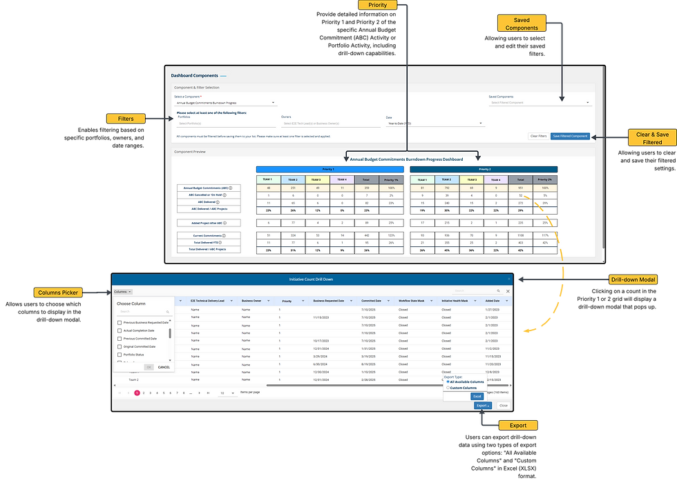
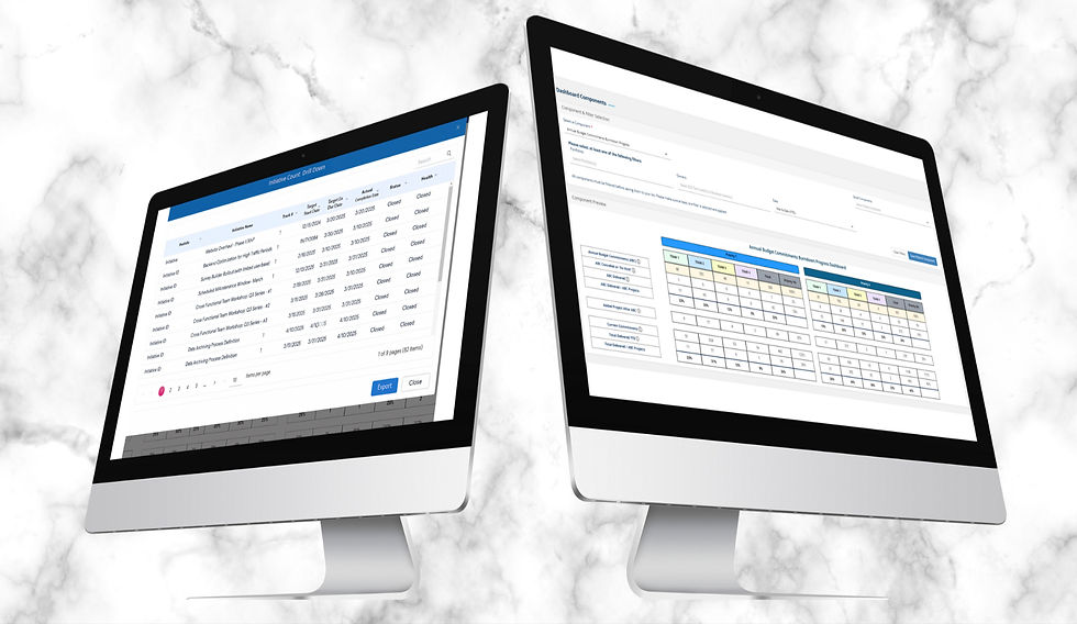
Annual Budget Commitments Burndown Progress Dashboard
Type: Web Application | Role: UI/UX Designer & Business Analyst | Project: Digital Platform Reporting
The Annual Budget Commitments Burndown Progress Dashboard is a visual reporting tool that helps teams understand how portfolio commitments evolve throughout the year. Designed for use within a larger Portfolio Reporting Platform, it provides insight into baseline commitments, additions, and removals—allowing stakeholders to monitor progress and scope changes in real time.
This dashboard supports clarity, transparency, and alignment between planned and active work, improving reporting efficiency across cross-functional teams.
Deliverables: High-fidelity Figma mockups, Lucid Chart, Snagit, interactive filters, modular layouts
Problem Statement
Users previously relied on outdated, table-based views to monitor annual planning and project churn. These static tools lacked clarity, interactivity, and failed to distinguish between baseline commitments and in-year changes. Without visual indicators or flexible filters, users struggled to track scope changes, communicate progress, or identify shifts in priority across different teams.
Possible Solution
Redesign the dashboard as a visual burndown tool with intuitive filters and export-ready views that include:
-
A summary view of baseline, additions, removals, and net portfolio size
-
Visual separation between Annual Budget Commitments (ABC) and in-year activity
-
Filter options by Team, Priority, and Owner
-
Color-coded indicators to reflect delivery timing
-
Contextual help and tooltips to guide new users
-
Export features that align with the applied filters
This solution supports data consistency across the Portfolio Reporting Platform and enables quick decision-making for stakeholders.

Task Flow
The Process of Reviewing Annual Budget Commitments Burndown Progress Dashboard
Typography & Colors
Font Used:
Open Sans|
ABCDEFGHIJKLMNOPQRSTUVWXYZ
ABCDEFGHIJKLMNOPQRSTUVWXYZ
1234567890
The Open Sans font is a popular choice for websites and user interfaces because of its excellent readability and neutral, friendly appearance. That’s why I chose to use this font.
Open Sans Bold
Open Sans Regular
Visual Design

_edited.jpg)